Project
Design Systems
Creating a scalable design system that empowered teams to ship faster and more consistently.
Overview
As products grow, design consistency often breaks down. Colours shift, components duplicate, and teams slow down. Enterprise teams waste time recreating similar interfaces while struggling to maintain visual consistency across large-scale applications.
An opportunity emerged to create a unified design system that helps teams move faster, stay consistent, and deliver better experiences.
Challenge
A design system is more than a library. Traditional libraries lack the sophistication needed for complex enterprise requirements they miss component variables, accessibility considerations and colour systems that adapt to different contexts.
My design set out to build a flexible system that balances creativity with consistency and gives everyone a single source of truth.

Design in action
The process started by auditing existing UI patterns and identifying overlaps. Key design:
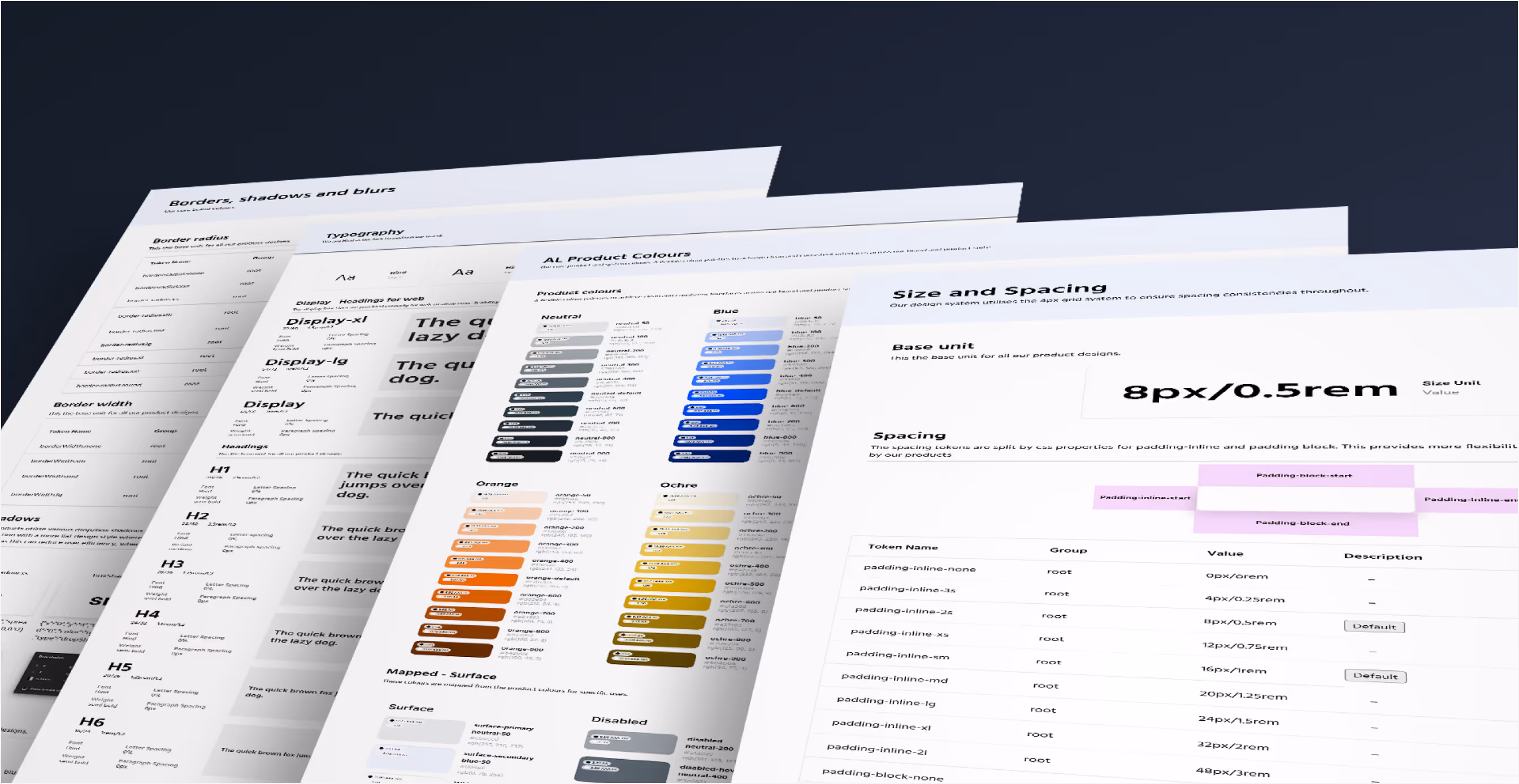
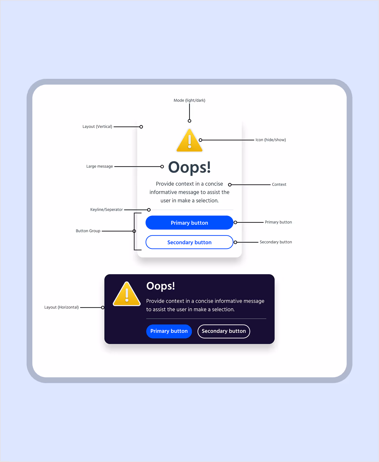
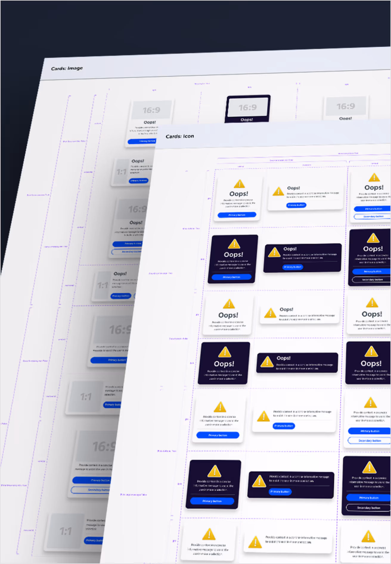
- Scalability: Modular components that grow with new products, featuring comprehensive property controls that enable precise customisation while maintaining design integrity.
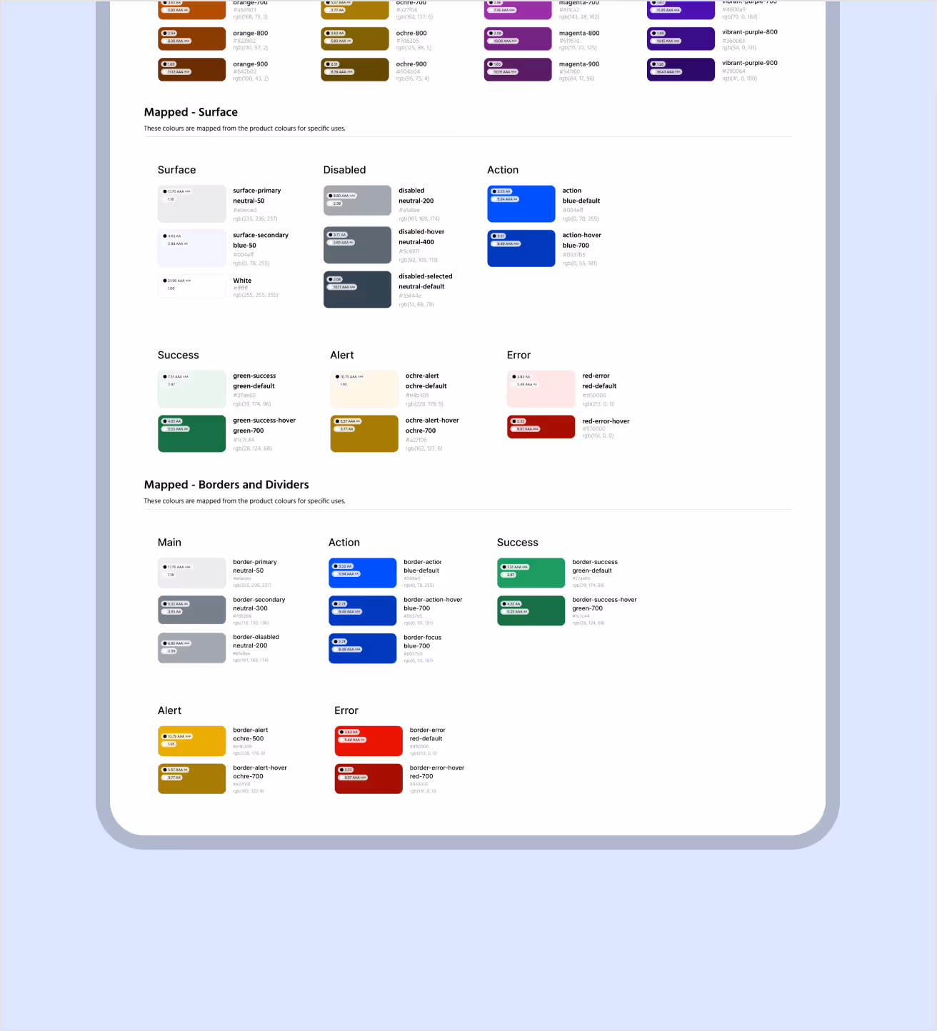
- Colour system: Surface treatments for backgrounds, action colours for interactive states and status indicators for system feedback.
- Accessibility: WCAG-compliant components with contrast ratios that work across light and dark modes, meeting NHS and GOV.UK standards.
- Collaboration: Clear documentation for designers and developers, with patterns and responsive behaviour.
Results
Product delivery teams shared the same visual language, built faster and produced more consistent results. Design reviews were quicker, handovers smoother and development time shorter. The design foundations and component states ensured products remained usable as they scaled.
Impact
The design system helped teams work more efficiently, improved accessibility and created a clear, consistent experience across every platform.

Deliverables
Tokens and variables guide
UI component library
Visual style guide
Usage and accessibility standards
Documentation and governance
Tools