Project
Project Miya
Bringing meaning to health metrics through human-centred design.
Overview
Health data is everywhere, from wearables and hospital systems to everyday wellness apps. But for most people, it’s fragmented, confusing and hard to act on.
My services were engaged to to design a single, trusted experience that connects these data sources and turns complexity into clarity.
Challenge
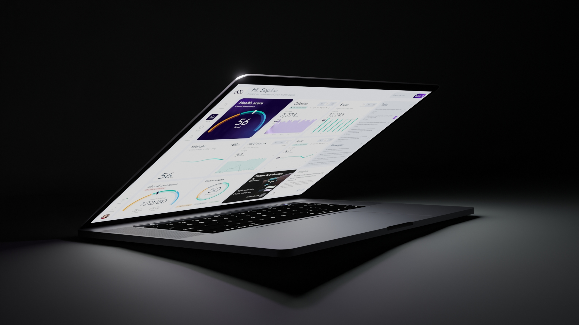
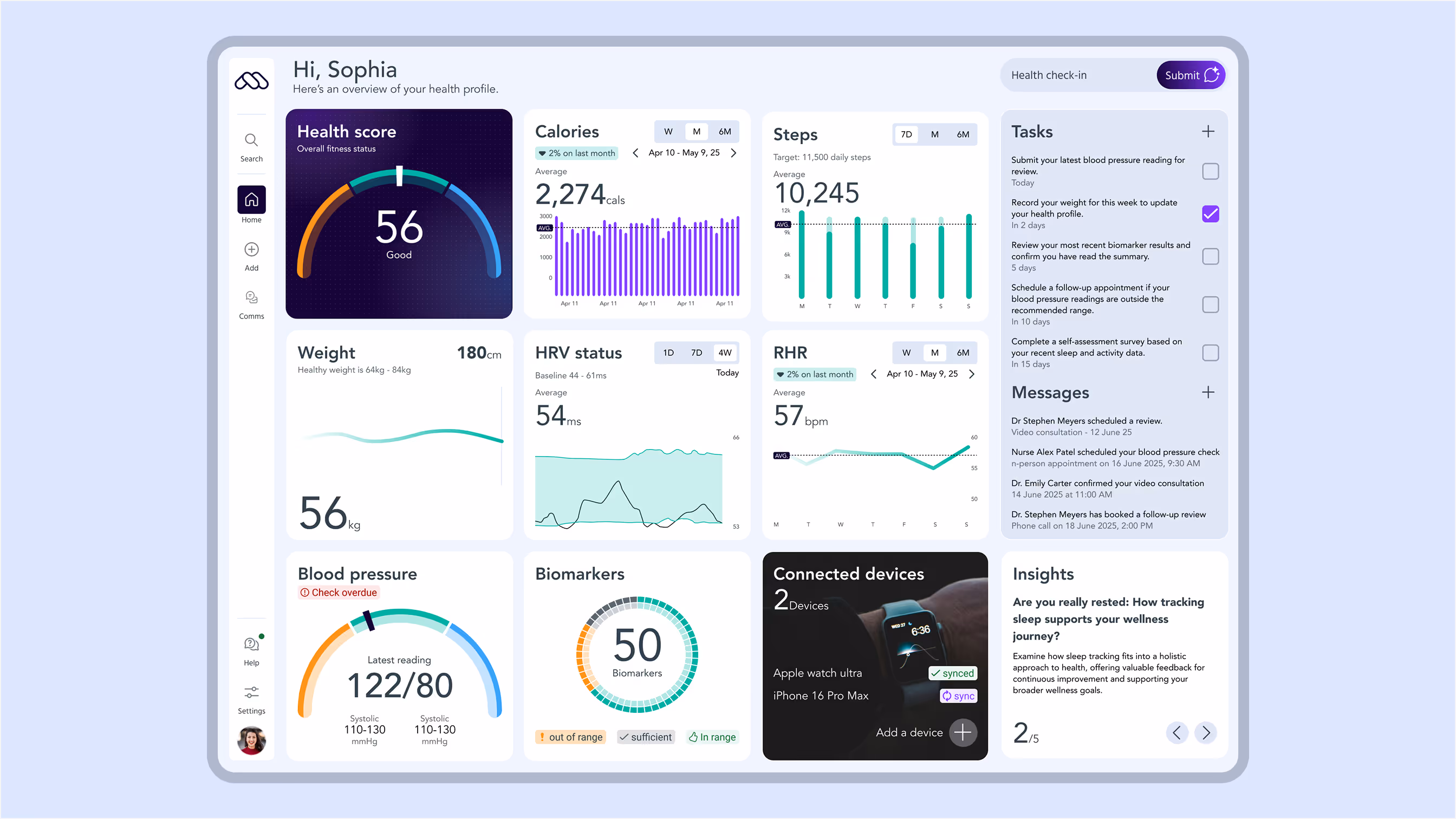
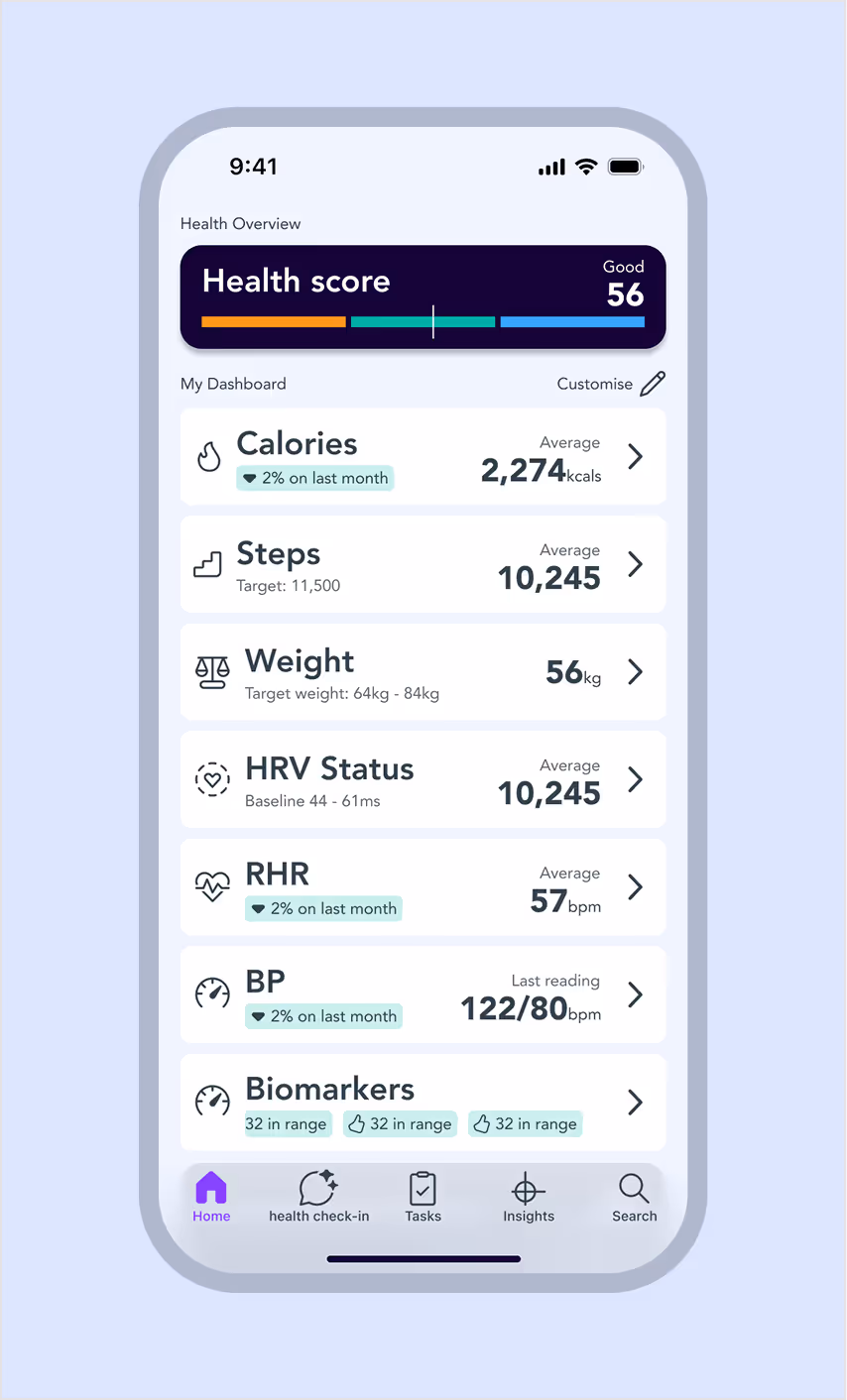
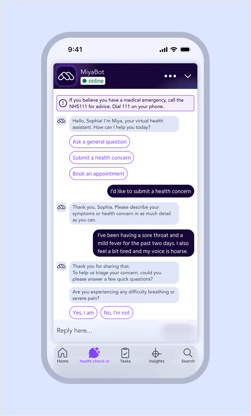
Project Miya was created to help patients and clinicians see the full picture of health.
My goal was simple: make data feel human. Through AI-driven insights, wearable integrations and a calm, intuitive interface. Miya helps users understand and improve their wellbeing with confidence.


Design in action
I applied design thinking from the ground up, combining research, co-design and iterative prototyping.
Key design:
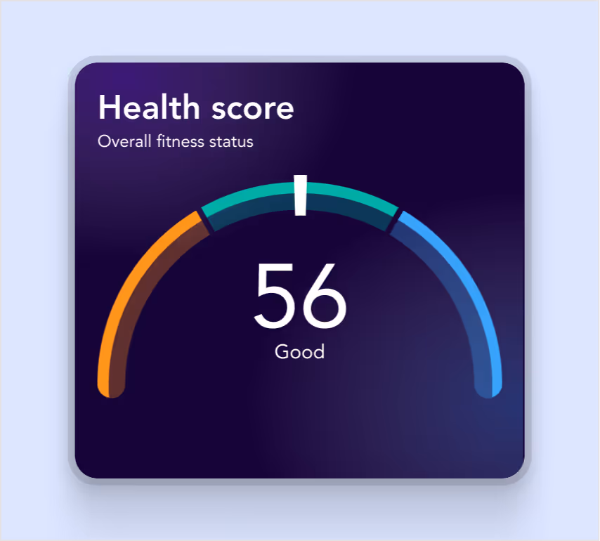
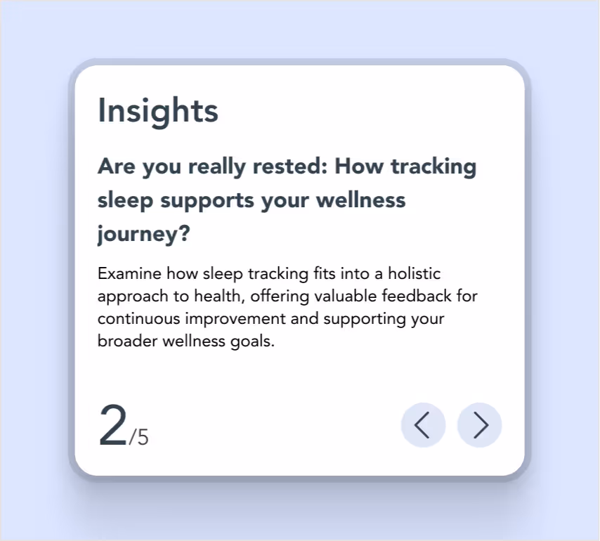
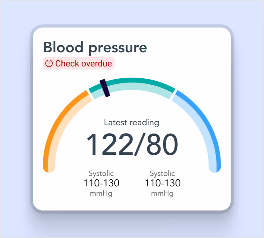
- Clarity through context: personalised dashboard visualises key health metrics clearly.
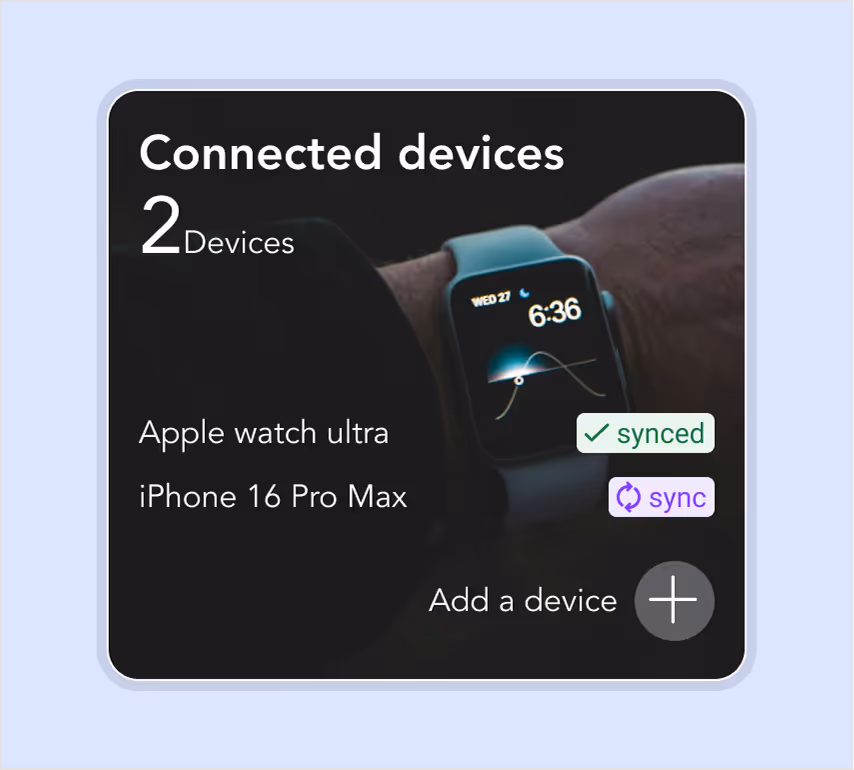
- Trust through transparency: every data source and device is shown openly, building confidence in accuracy.
- Motivation through insight: AI turns raw data into actionable recommendations.
From early wireframes to high-fidelity prototypes, I worked closely with clinicians, data scientists and patients to ensure usability, accessibility and accuracy across every device.
What changed
Miya transformed how people engage with their health data. The unified interface simplified tracking and improved understanding. For clinicians, it delivered a consistent design system that scales effortlessly across mobile and desktop, helping teams make faster, data-driven decisions with confidence.
Impact
Miya bridges the gap between data and understanding, empowering users to see patterns, track progress and take meaningful action.
It reduced reliance on fragmented systems, increased engagement and provided clinicians with a clear, trusted foundation for patient insights.


Deliverables
Web app design
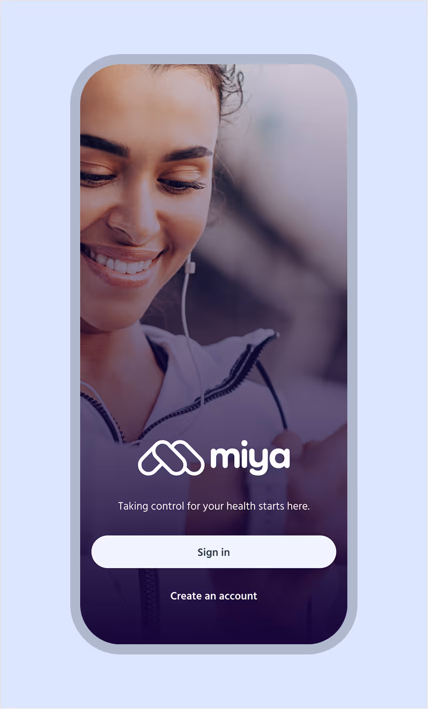
Mobile app design
Branding concept
White paper
Tools