Design systems, sewn in. Meet Seam.
A design tool for Mac. Start from a real design system, stay on brand automatically, and hand off clean code to developers.
Apple silicon or intel. Your files no account.

Project
Your brand in, your system out.
Pick a base and a brand, and Seam builds the rest: colour ramps, type and spacing scales, light and dark modes, and real components bound to your tokens. Fill in your brand yourself, or hand Seam’s template to your own AI and import what it returns. You choose. Seam does the maths.
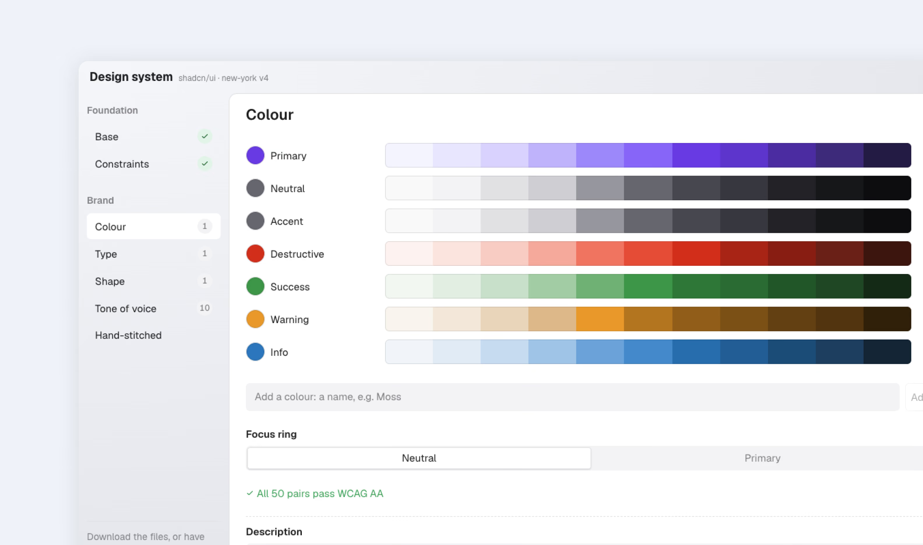
A brand in a few choices, contrast checked as you go
Pick your colours. Seam makes each one an 11-step ramp and fills in dark mode, then checks every pair that sits together against WCAG. Fix one, or fix them all.
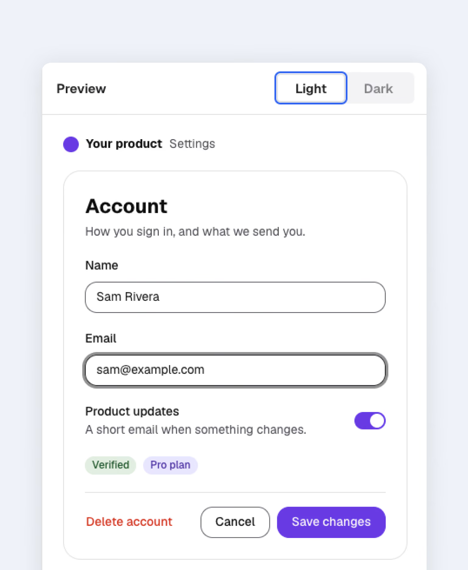
See it before you use it
A real screen in your brand, in light and dark, as you set each choice.
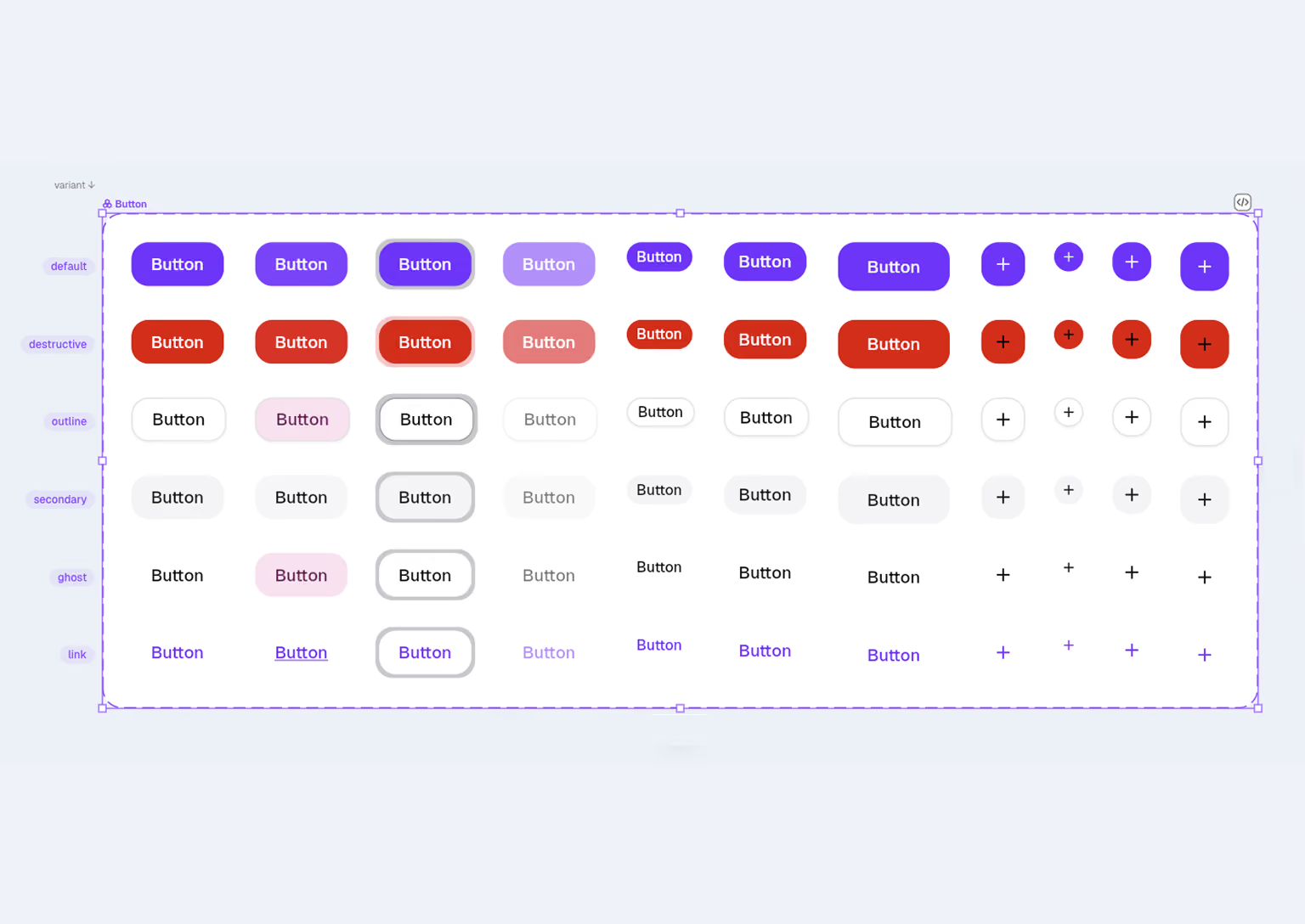
shadcn/ui, built in
Button, Badge, Input, Switch, Card and Tabs, every variant, bound to your tokens and ready with their code.
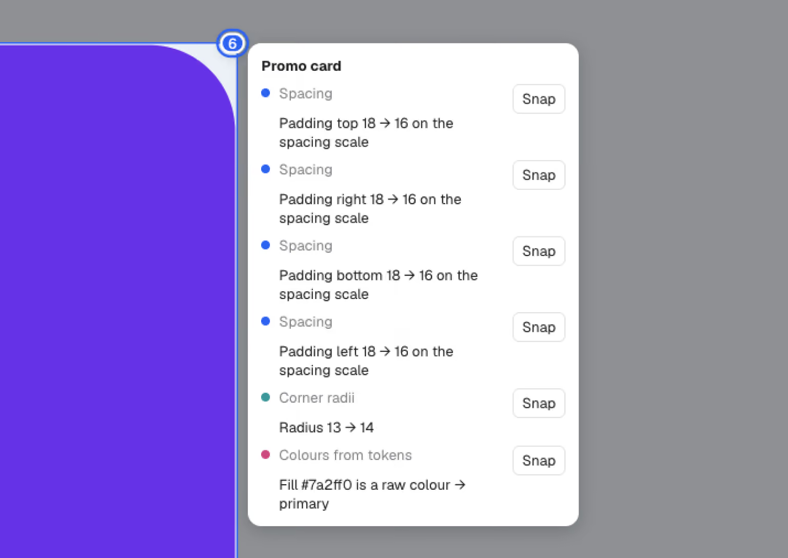
Rules that keep work on system
Spacing, type, radii, colour and contrast. Turn on the lens to see what’s drifted, then snap it back.
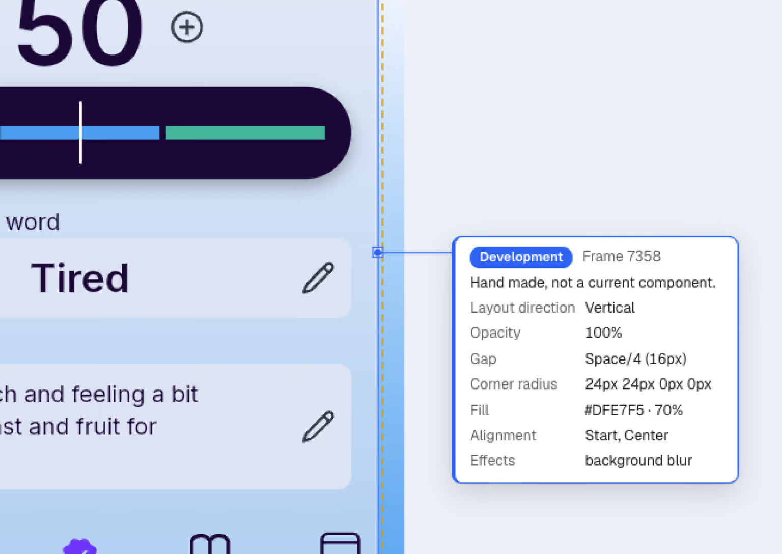
Mark what a human makes
Flag the parts designed by hand. AI tools leave them alone.

Your brand in, your system out
Give Seam’s brand template to your AI and import what it returns, choosing which changes to keep. Seam then writes your brand, the design system and its rules as three files your AI coding tools can follow.
You own it
Your files. Your disk.
Pick a base and a brand, and Seam builds the rest: colour ramps, type and spacing scales, light and dark modes, and real components bound to your tokens. You choose the brand. Seam does the maths.
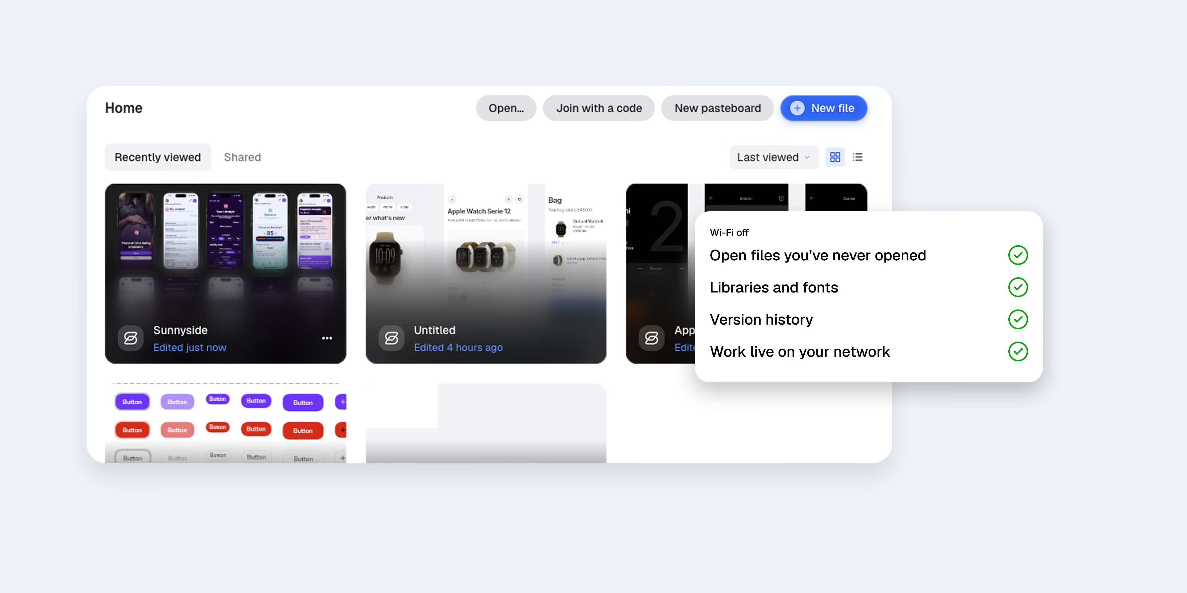
Works offline
Every file, every page, wherever you are.
History travels with you
Named versions and autosaves live in the file.
Bring your Figma work
Import layers, text and styles from Figma.
Work together
Work live. Keep control.
Share a file through a folder you already use: iCloud Drive, Dropbox, Google Drive or OneDrive. When you're in it together, cursors and edits arrive live, encrypted end to end.
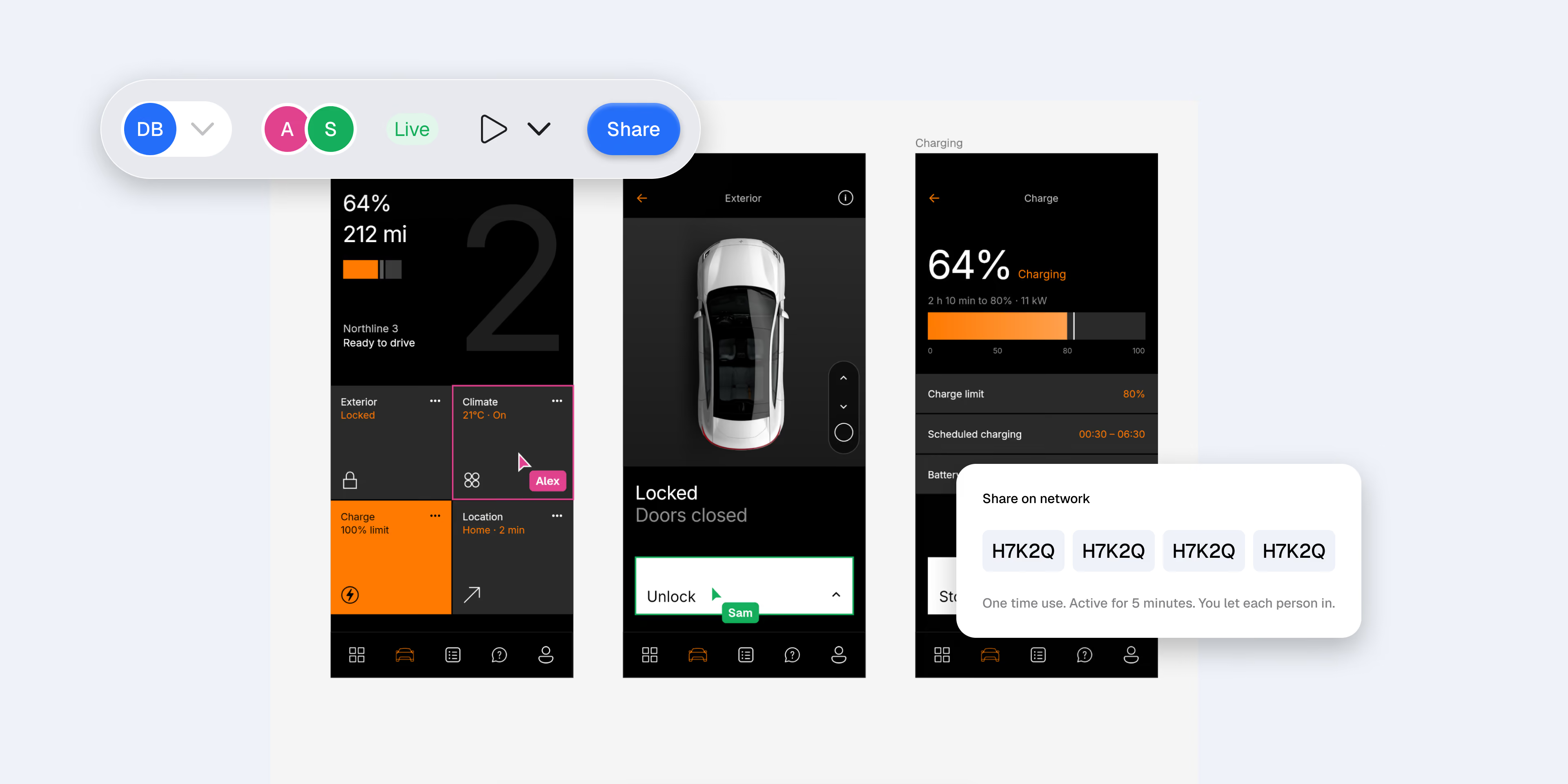
Same office, no internet.
Share over your network with a one-time code.
You choose who joins
You let each person in before the file opens for them.
Follow and light.
Present to the room, or follow someone'sview.
Work together
Dev Mode is free. Bring the whole team.
Developers inspect, measure and copy code without paying for a seat.
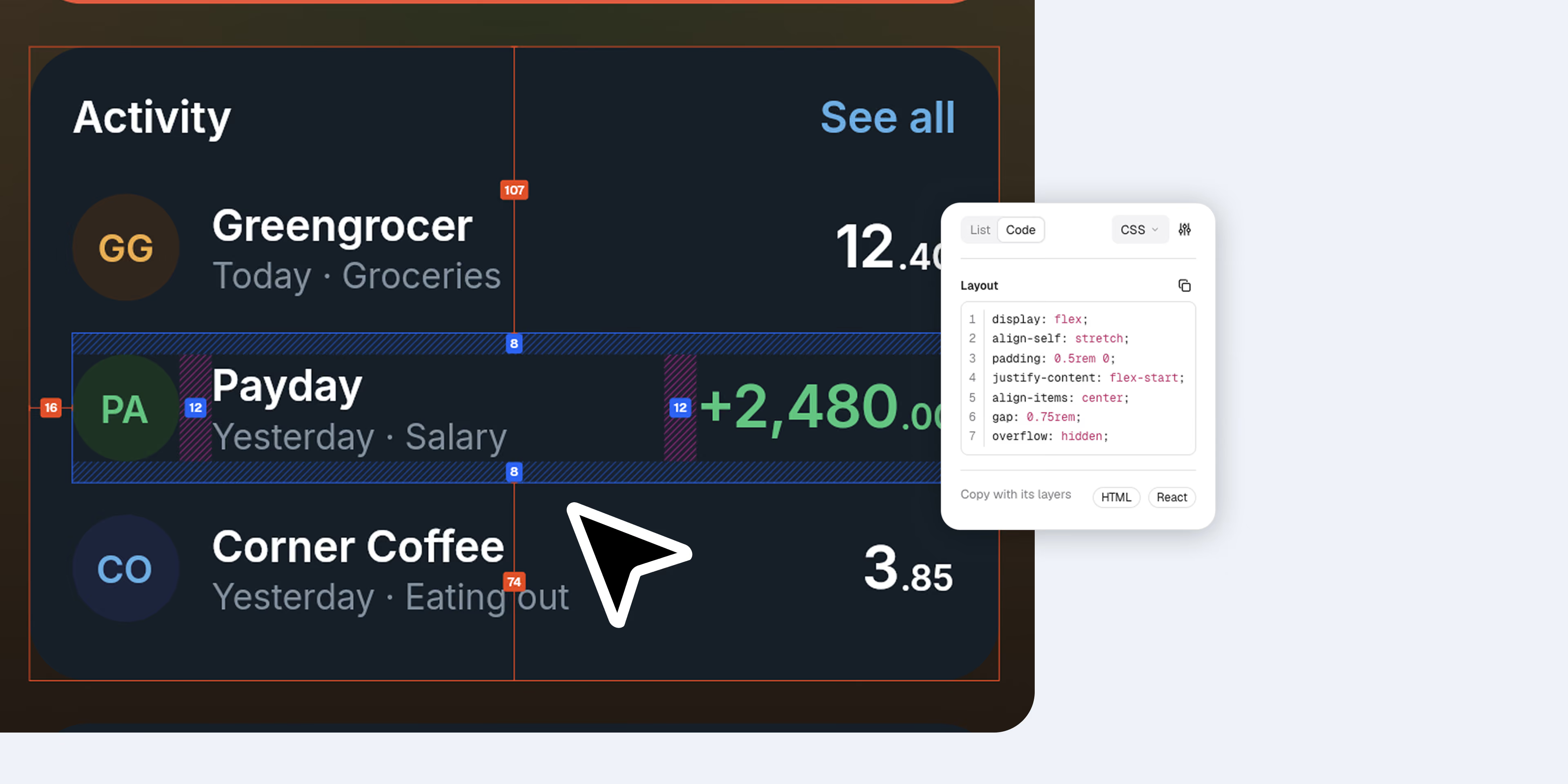
Whole screens as code.
full HTML page, or React with Tailwind, not just one layer at a time.
Code Connect, no setup.
Templates live in the file. No repo, no command line.
Checked before handoff.
Contrast, target size and alt text, and accessibility notes written into the code.
Prototype and motion
Prototype it. Animate it. Ship it.
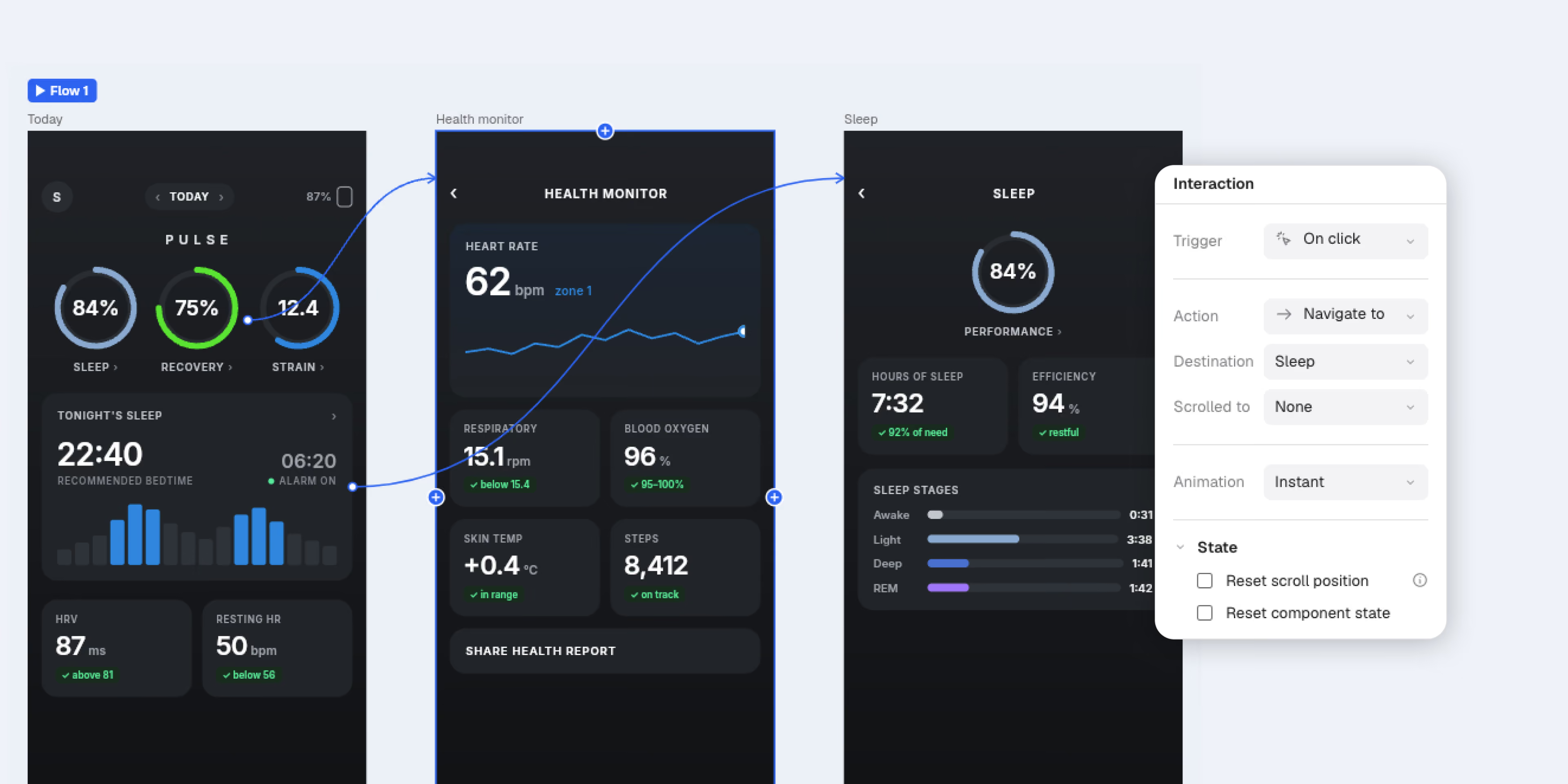
Link screens with Smart animate, overlays and variables, then present on 16 devices. Give any frame a timeline and export it as CSS or GSAP, ScrollTrigger included.
Work together
Keep your references beside your work.
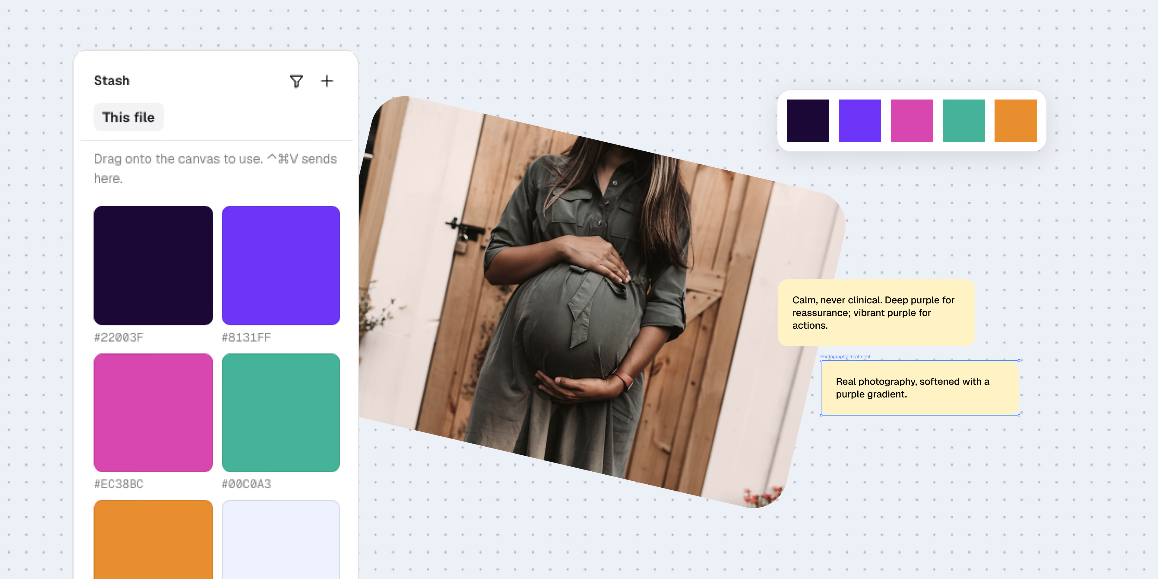
Every file and folder can have a Stash. Paste images, links, colours and notes, and Seam lays them out. Pull a palette from a photo, or find a reference by colour.
Capture from anywhere
Send your clipboard directly to your Stash.
Drag straight in
Drag straight in. References drop onto the canvas as layers.
A palette from a photo.
Pull colours out of any image you paste.
Everything else you reach for.
Dark mode for your brand
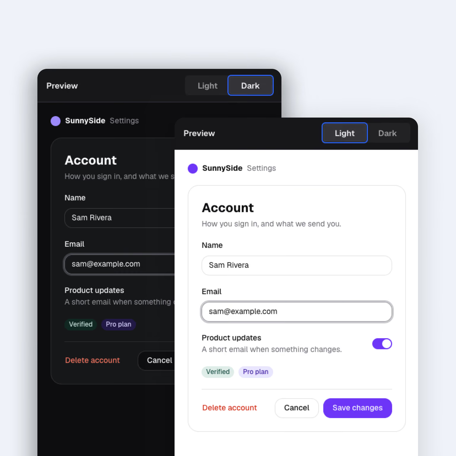
Seam builds a dark version of your brand from the light one, contrast checked. Switch any frame between modes in a click.
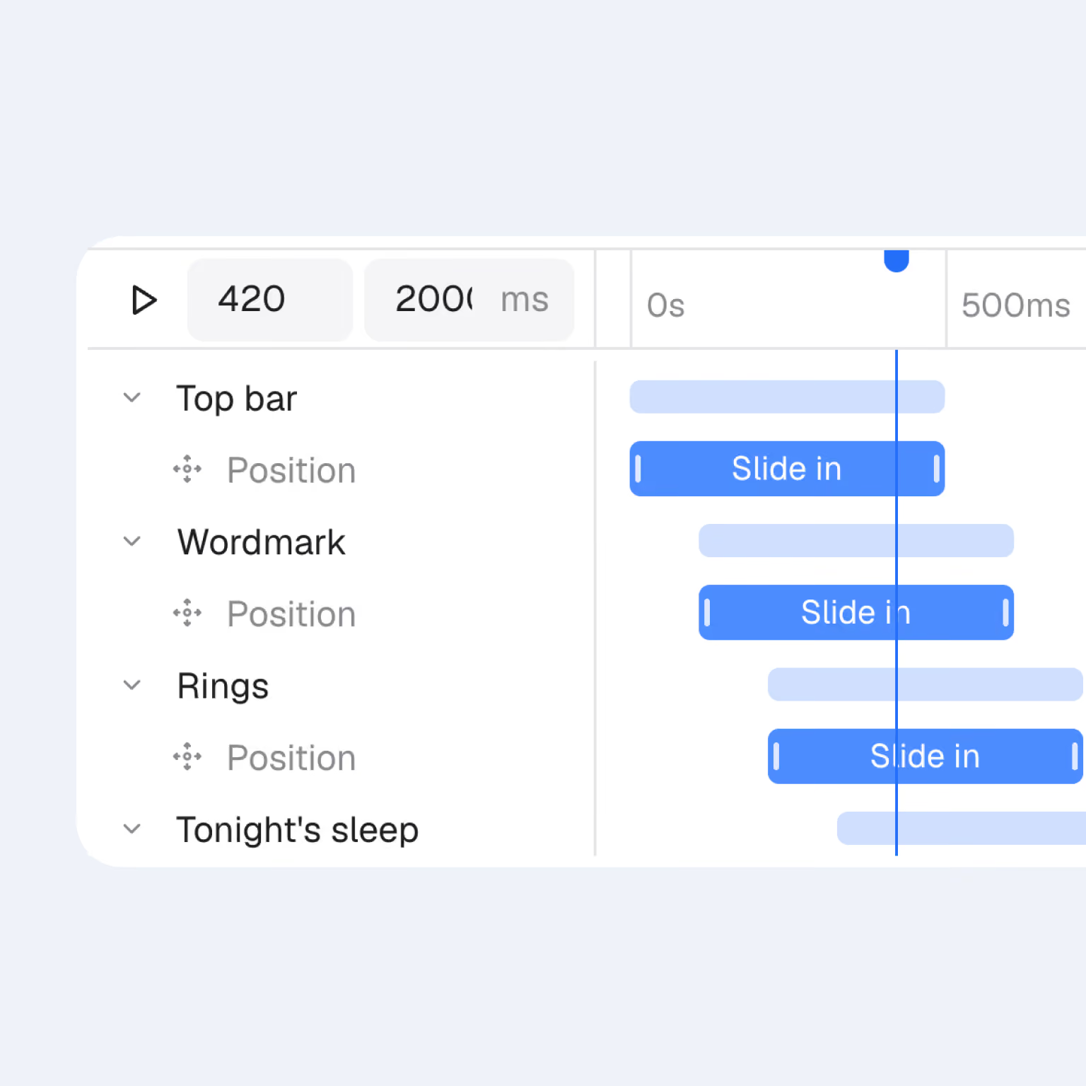
Motion
Give any frame a timeline. Stagger, ease and follow paths, then export as CSS, GSAP, GIF, video or Lottie.
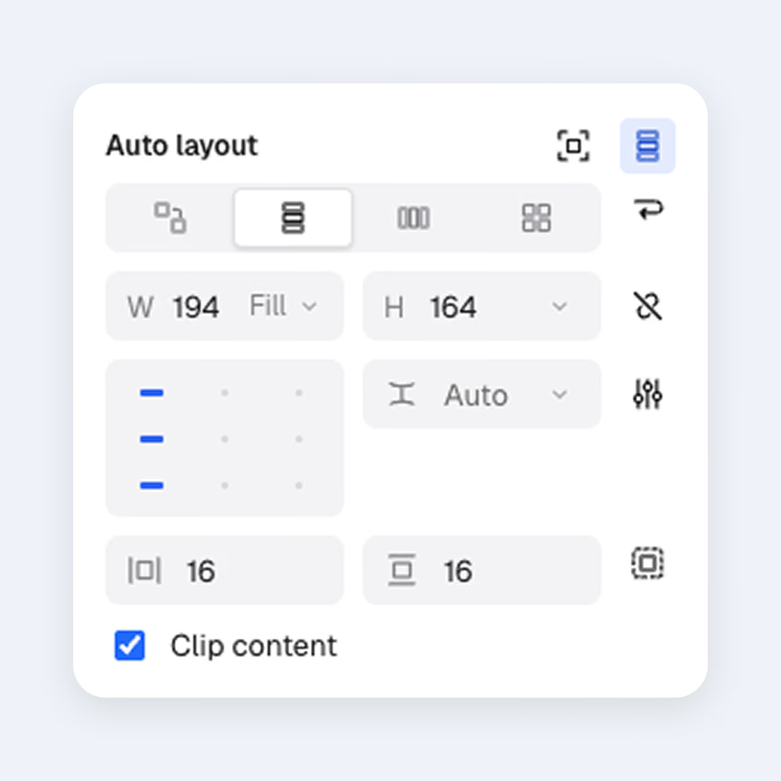
Auto layout
Wrap, hug and fill, with grid tracks you size and drag on the canvas. Figma's shortcuts, so there's little to relearn.
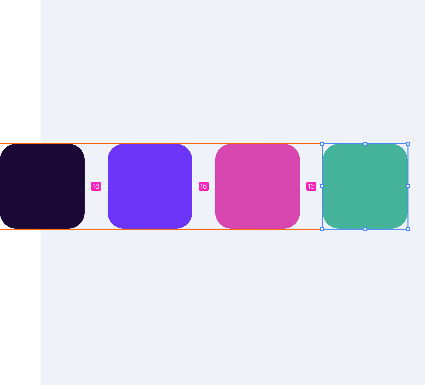
Intuitive spacing
Drag a layer and pink markers show when the gaps match. Even spacing, without measuring by eye.
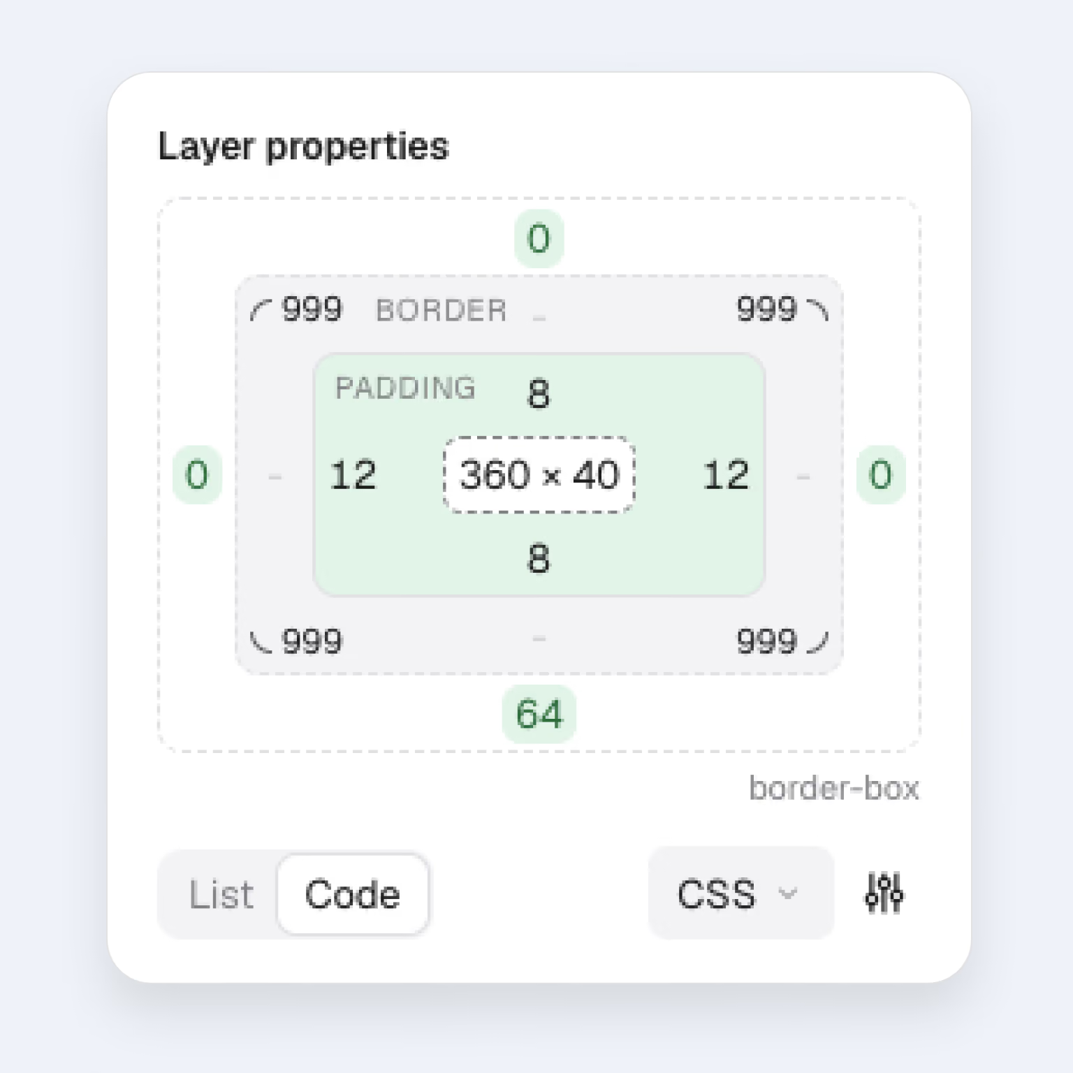
Box model
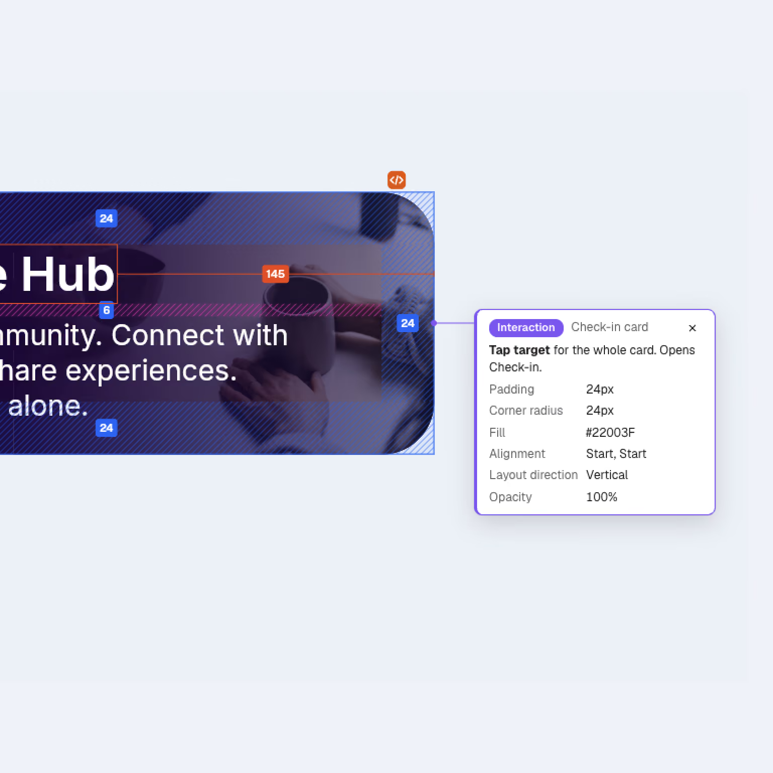
Padding and borders as rings you click, type into or drag. The same model developers see in Dev Mode.
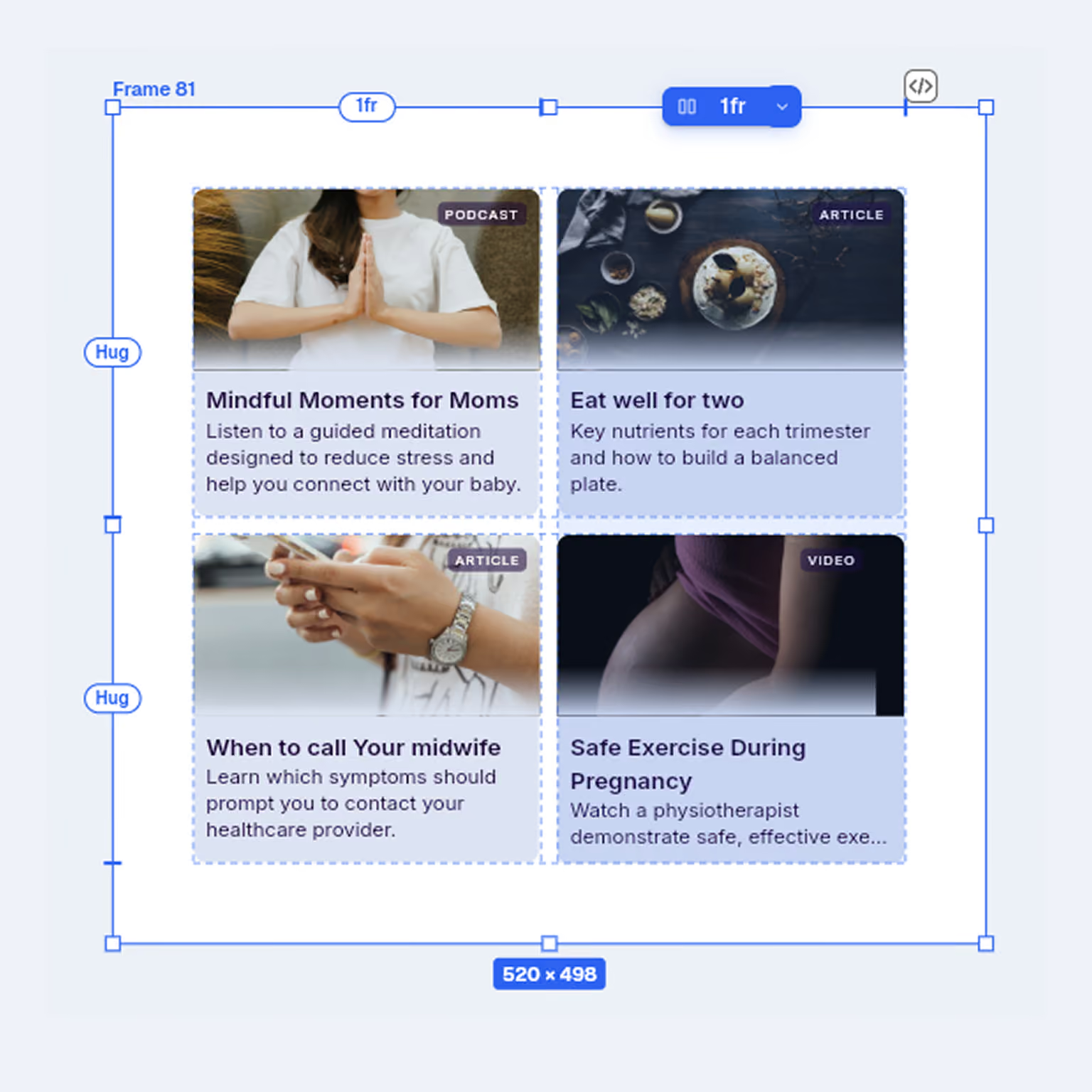
Grid
Columns and rows you size as fixed, fill or hug. Drag tracks on the canvas, and let layers span cells.
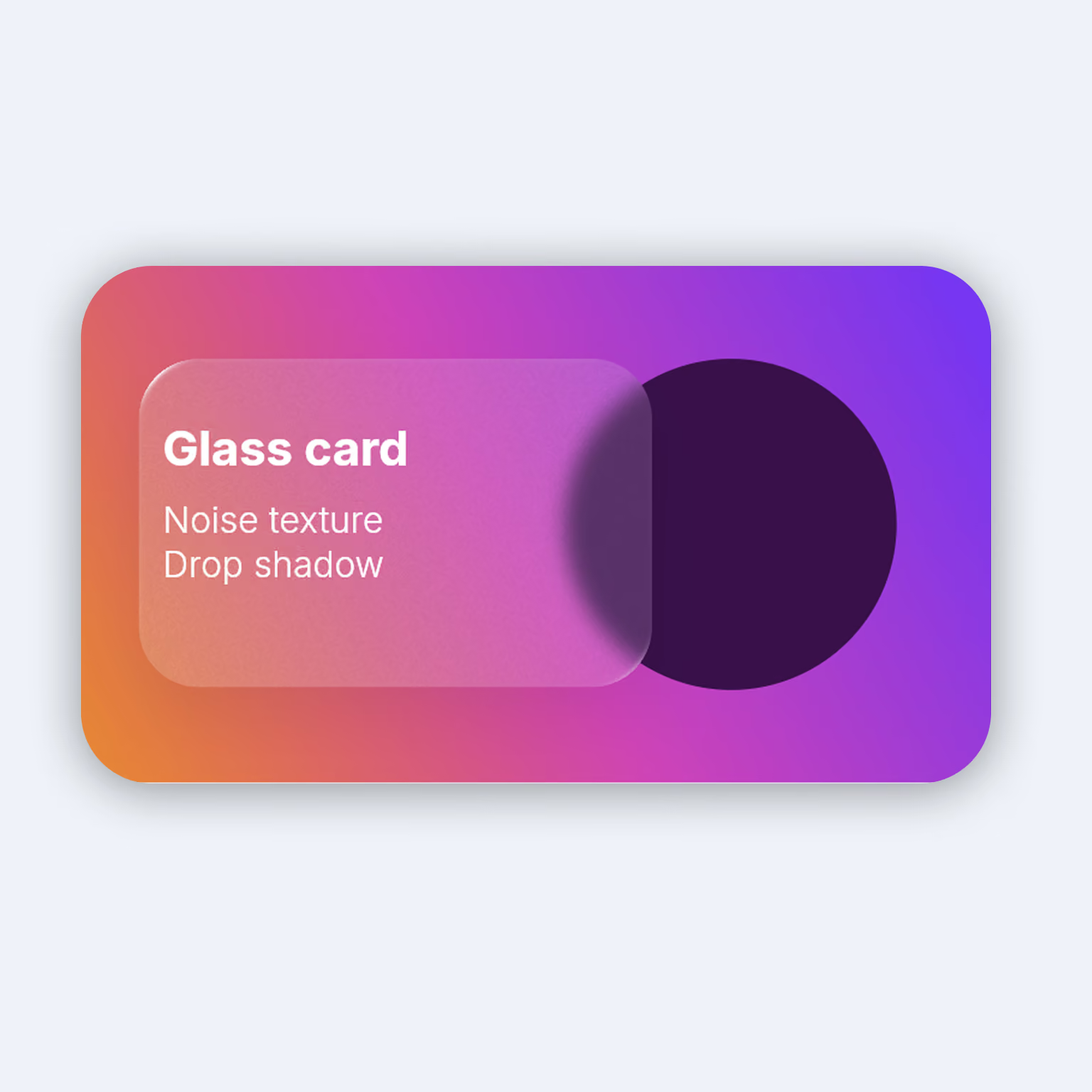
Effects
Glass, noise, texture and progressive blur, alongside shadows. Every effect stays editable.
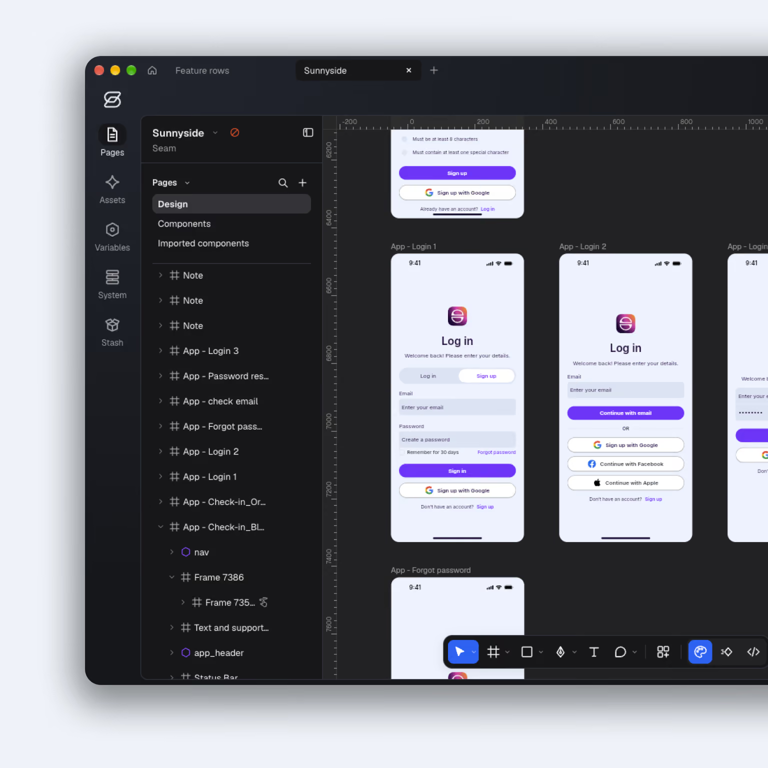
Seam, in light or dark
Seam itself comes light or dark, or follows your Mac. Easy on the eyes, late into the night.
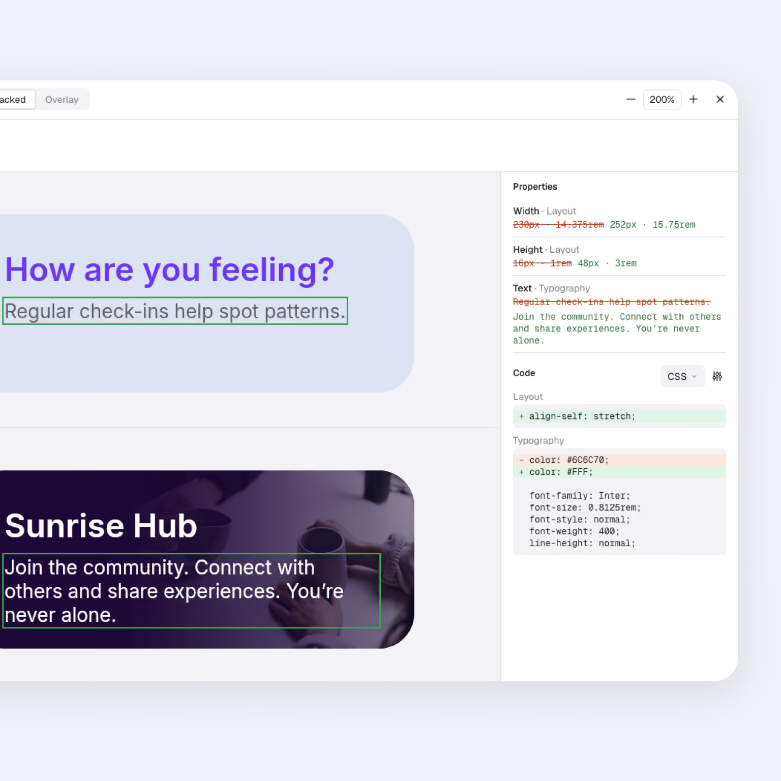
Version history
Every version saved in the file. Compare any two side by side or overlaid, and restore in one step.
Annotations and measurements
Notes, specs and saved measurements pinned to layers. They update as the design changes.
Work together
Seam feels familiar but a little different
Figma is the standard. Here’s where Seam goes further.

Seam
A base design system library built in
Add your brand in a snap or let AI do the leg work
Contrast checked as you change the brand
Writes your system for your AI tools
Dev Mode free for everyone
Whole screens as HTML or React
Files on your Mac, not a cloud
Works fully offline
Figma professional
Start from a community kit
Variables added by hand
Check by hand, or with a plugin
Design system files for AI
Needs a paid seat and the MCP server
One layer at a time
Files in Figma’s cloud
Only files you already had open
Yes, while it's in beta. Later, designing will need a licence. Opening files, Dev Mode and exporting stay free.
Shadcn/ui's tokens and components, your brand on top, and rules to keep work on system. It's yours to change, and more bases can follow.
Seam gives you your brand as a template. Fill it in yourself, or ask your own AI to, then import it and choose which changes to keep. Seam then writes three files for your AI coding tools: your brand, the design system and its rules. No accounts or connections.
Yes. Export with the Seam plugin for Figma, then open the file in Seam. Layers, text and styles come across today. Components, variables and prototypes are on their way.
Not for your files. To work live with others during the beta, you sign in with Google.
Only people with access to the file. Live sessions are encrypted end to end, so nothing in between can read them.
Not yet. Seam is Mac first, for Apple silicon and Intel.
Yes, Dev Mode is completely free. Giving anyone with a code access to only the dev tools they need.